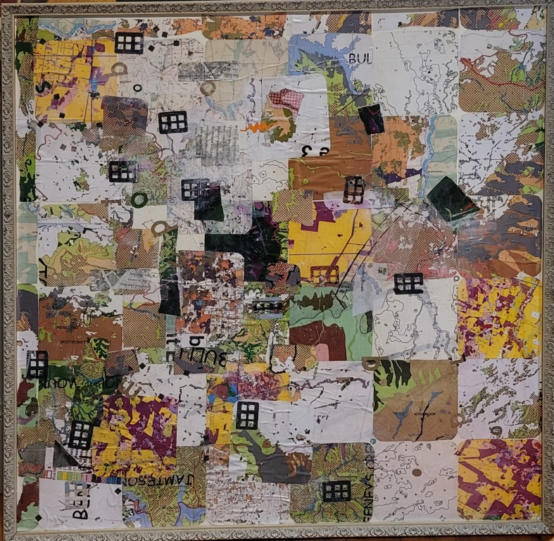
After having so much fun replicating and refining and adding to the original collaged kimonopolies last week at Sturt, this week I played again!
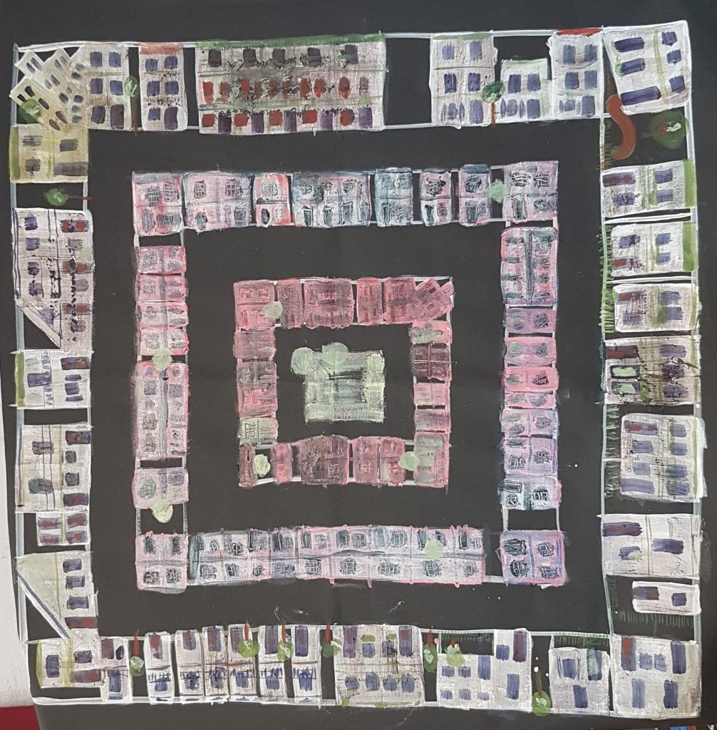
This time I wanted to play with the Monopoly form as if they were actually houses. So this is where I got to.
So much more to go, but it’s an interesting start.
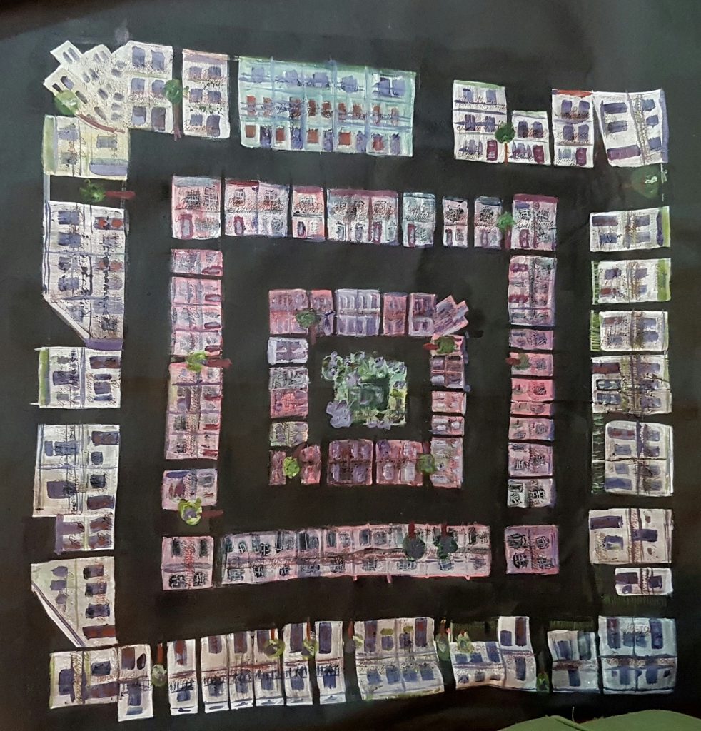
Started with a white “undercoat” for the monopoly form, done freehand (no measuring this time). It’s on a 1 metre canvas.

I took a side-trip to using gouache directly on the black canvas, but then got into adding layers to the white undercoated “houses”, adding colour, taking it away.
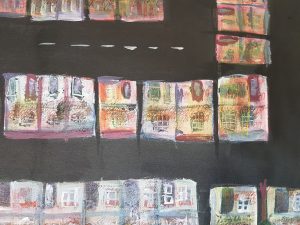
The hilarious thing was me and Anna consulting each other on what to do to make objects come forward (we agreed, warm, dark, textured)… so i tried to make the centre of the boards come forward. Of course I forgot the most important one: perspective comes with size – as the outside houses are bigger than the inside ones they of course look closer. So I ended, in spite of warming and darkening the centre, with a kind of 7 circles of hell schematic (not what i wanted).
Changed the centre to a “park” and will work more on this (tidy up the tiny spots and drips of white which distract, may add some balcony iron lace (thinking my “priorite” stamp with brown ink may be a quick way to do that… ). So many ideas.
Update one week later:
Set up a place to paint at home (i moved 3 months ago, i’ve been doing books ever since, but i do have space at home now).
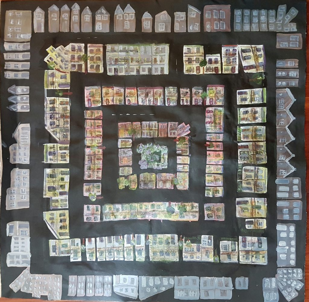
Tidied up the white spots, got rid of guidelines, made the trees and the park a more pleasing green.
Added some rubber stamps (urgent in red, and Priorite in brown) to give texture and suggest iron lace). Fixed some bits that were annoying me.
It’s still not quite right. Next steps are another layer (maybe apartment buildings now? I really like the top right hand corner apartment towers (i know that’s not what they are, but it’s what i see!). Also thinking I’m going to tone down the pink of the 2 centre house rows; i just don’t like pink that much.
an ongoing discovery really!
Update yet another week later:
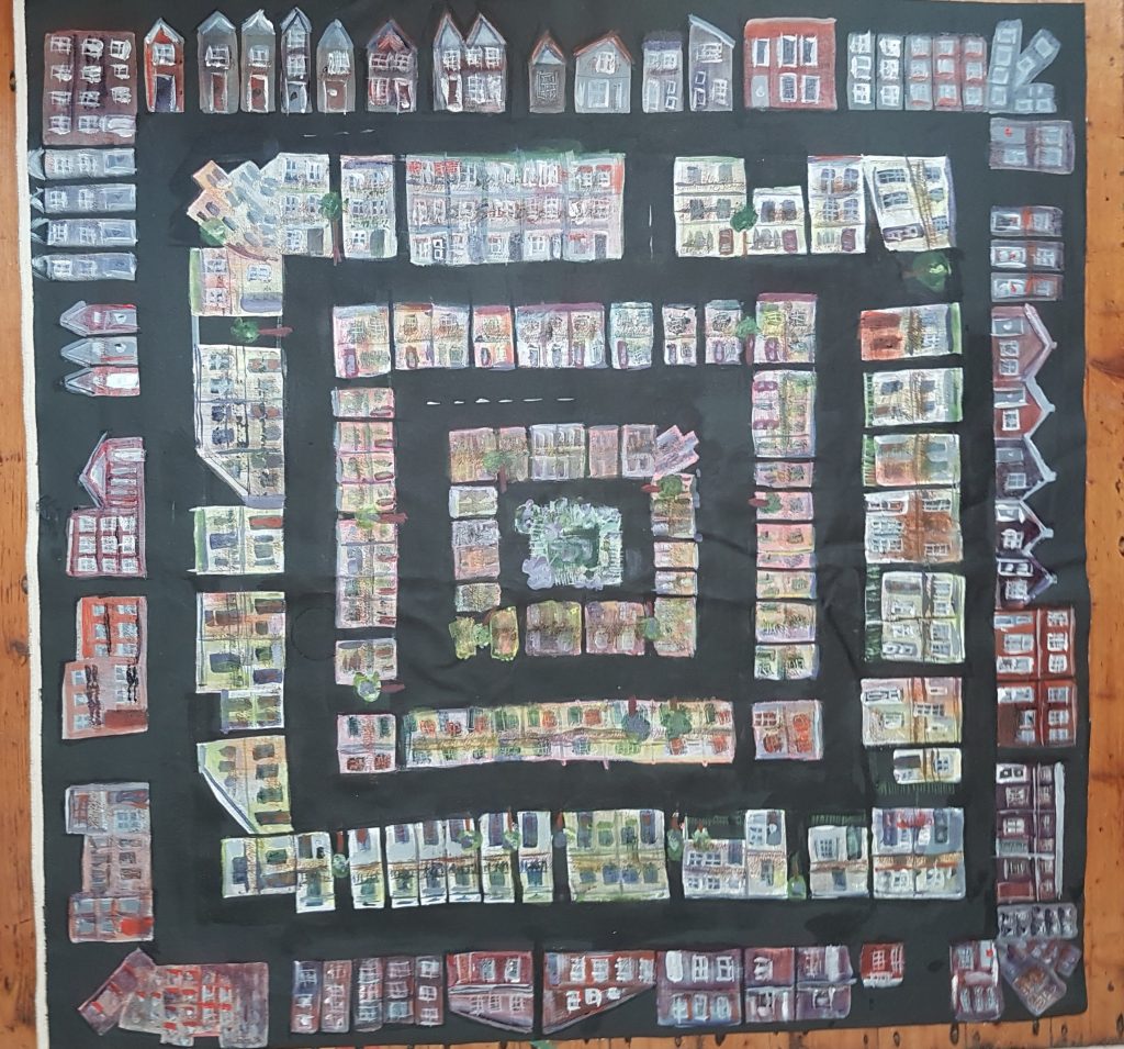
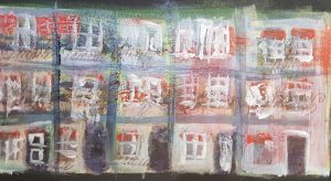
So I added another layer of houses. They are still a little beige compared to the rest of the work. This photo was taken at night inside so it’s yellower than the real thing.
the outside layer now needs some textured railings (my stamps), and to brought in line colour-wise with the rest of the piece. It’s a lot of fiddle, but i’m really enjoying playing!
update another week later
I probably should have made these all separate entries really!
added more detail, more texture more colour to the outside layer. slowly bringing pieces of the outside to the inside, and giving more detail and random beautiful colour to the inner layers. still more to go!
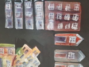

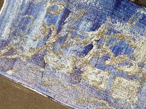
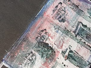
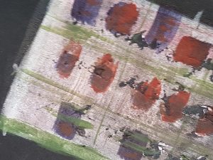
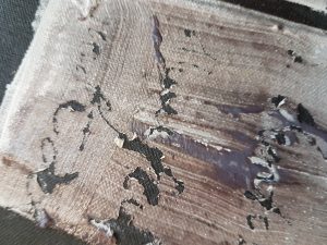
Here are some gorgeous texture pix that came out of the process.